A loading screen is the only place in a product where users watch without doing anything. On Qiplim, the app I'm building, those seconds show a spinner. I produced what it takes to replace it: one loop per feature, silent, on a white background, with the label placed by the app over the video. The credits went to Magnific.
It took 3 regeneration passes to get there, and the last one changed the design of the whole series. Every video in this article is fully AI-generated.
A loading screen is space you've already paid for
In 1995, Namco filed a patent on mini-games that keep players busy while a video game loads. The idea came from Ridge Racer, which ran a full game of Galaxian while the race loaded. The patent held for 20 years, until it expired in November 2015, and until then other studios had to pay for a license or work around the patent, according to the Electronic Frontier Foundation.
So the video game industry understood very early what business software still overlooks. Waiting time is attention space. It's already paid for, it's already being watched, and most products put a spinner there.
Qiplim turns documents into interactive activities. Importing a presentation, generating a quiz from a PDF, launching a session: each time, models are at work and the screen waits. That's the place for product education, the kind nobody reads in a help center.
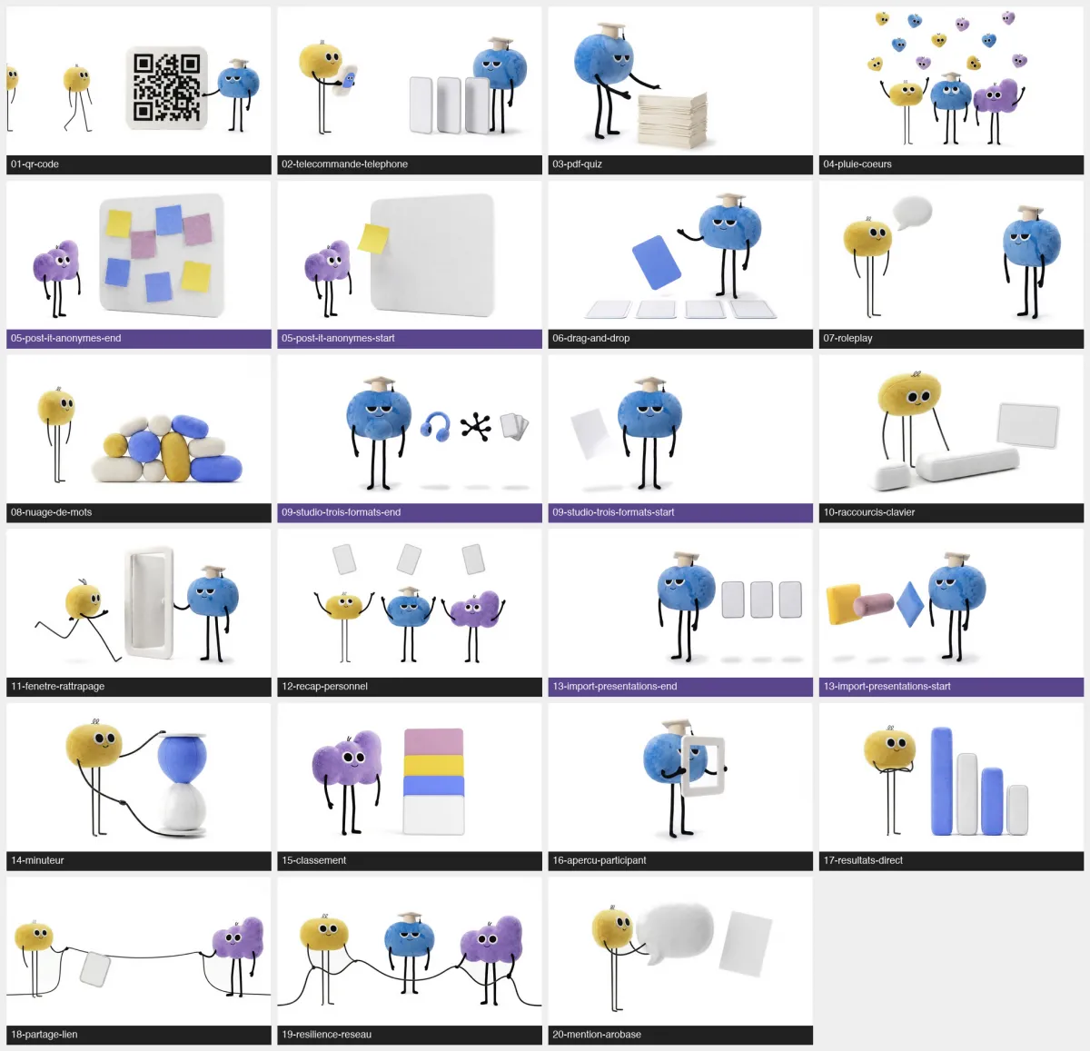
The brief fit in 5 lines. 20 loops of 5 seconds, one per feature. Silent. A pure white #FFFFFF background, to blend into the interface. No text in the image. Autoplay and infinite loop, with no controls: these are interface backdrops, watched out of the corner of your eye while the app works.
5 decisions that make a series of loops manageable
Producing a video that loops is a different discipline from producing a video that tells a story. These 5 decisions are what made the series possible.
Text moves out of the video
Video models render accented French very poorly. A word comes back as a string of plausible glyphs, and an accent floats above the wrong letter. Instead of fighting it on every generation, I took the label out of the image: the app displays it in HTML over the video.
3 gains at once. The typography stays exactly on brand. Fixing a sentence no longer costs a generation. The series becomes translatable without touching a pixel.
The constraint shows up elsewhere: no text, number or logo may appear in the generated image anymore. The ban has to be repeated in every prompt, because models spontaneously add fake text to the screens and signs they draw.
The camera is locked
This was the most useful break from standard practice on the project. Video prompting guidelines discourage the static shot and frontal framing, which produce a dead image. For a loop, the rule flips. A camera that drifts by 3 degrees makes a seamless join impossible, because the last frame can no longer land on the first.
Focal length, height, distance: everything is locked in the prompt. Only the objects in the frame are allowed to move.
The cycle closes
A clean loop follows a conservation rule. What comes in goes out. What is consumed is replaced. Nothing piles up in the frame.
Without that discipline, the last frame no longer looks like the first and the loop jumps on every pass. The eye catches it immediately, even on a 200-pixel thumbnail in a corner of the interface.
Quantities are hard-coded
“About 10 hearts falling” produced more than 30 objects. Any vague quantity gets multiplied by 3, and I come back to it in the mistakes below.
The template is code
The 20 prompts aren't written by hand. A Python script generates them from a spec for each video, plus shared blocks: the style, the characters' identity lock, the format and the prohibitions. The script produces 34 files, reproducibly.
Every time I discovered a rule, I added it in one place, and all 20 prompts inherited it. That's what made it possible to correct the series 3 times without it drifting.
Beyond 5 visuals in the same series, prompts written one by one end up drifting apart. The unit of work becomes the template that builds them, and the prompts are simply its output.
The 5 mistakes I paid for
All 5 are reproducible, and each one has a short fix. I list them in the order I figured them out.
1. References framed too tight
The symptom. The characters came out with stumps instead of legs.
The cause. I had supplied the expression sheets as references, and they frame the face and cut off the legs. The model couldn't guess what it couldn't see, so it made something up.
The fix. Reference the full-body views, and express proportions as ratios to the body instead of percentages of the frame. It took 2 full regenerations of the series before I traced the problem back to its cause.
2. Vague quantities get multiplied by 3
The symptom. “About 10 hearts falling” produced more than 30 objects, to the point of making the text displayed on top unreadable.
The cause. A density instruction filed under the format section carries no weight against a vague quantity written in the scene description.
The fix. 3 elements together: “exactly 10, no more”, a measurable spacing rule, and an explicit description of the failure to avoid.
3. The white background is never white
The symptom. On a white interface, each video formed a visible gray rectangle.
The cause. Despite the repeated instruction “pure white #FFFFFF”, the model outputs a studio cyclorama, between 236 and 250, with a slight gradient.
The fix. Systematic post-processing. A simple color distance threshold isn't enough: measured on these images, the darkest corner is at a distance of 31 from white, the contact shadows at 25, and a white felt panel at 42. No single threshold whitens the background without erasing the shadows that ground the characters. You have to target by connectivity to the edges of the image.
4. Describing a state the character can't have
The symptom. A character ended up with a plush ball sewn under its mouth.
The cause. I had written “the character has a slightly rounded belly” to suggest it had just swallowed a document. But this character is a blob: its body is a single mass, and it has no belly. The model took the instruction literally and built the missing part.
The fix. Describe the anatomy through what exists, and explicitly forbid any added protrusions.
An image model doesn't know an instruction is impossible. Name a body part that doesn't exist and it will build one.
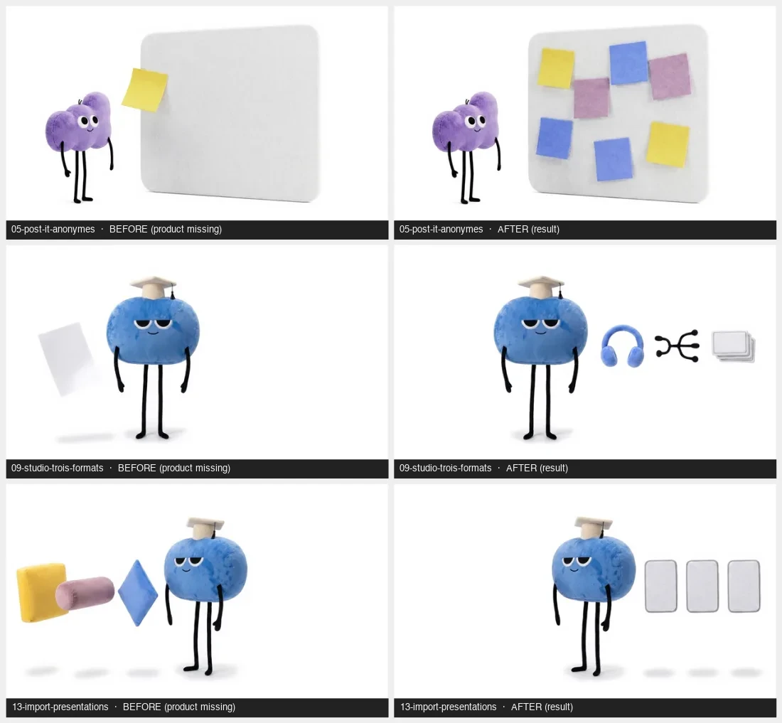
5. The first frame already showed the result
This one cost the most, and it's the only one that changed the design of the series.
The symptom. On 3 test videos, 2 distinct behaviors. The sticky notes piled up on top of each other without the old ones leaving. The 2 transformation videos produced a near-frozen shot, with nothing moving.
The cause. My anchor image showed the middle of the cycle, with the produced objects already in place. The model reads that as stable scenery: either it has nothing left to tell and freezes the shot, or it stacks new objects on top of the old ones.
The fix. The starting image is point zero. Everything the action produces must be absent from it: a bare board, half the frame empty. A second image shows the result, and a 0.3-second crossfade in the edit joins them.
2 families of loops
That last fix revealed 2 ways of producing a loop, and they aren't generated the same way.
| Family | Principle | Images supplied | Looping |
|---|---|---|---|
| Pass-through | what comes in goes out, nothing is created | a single one, placed at the start and the end | closes natively |
| Production | the action makes something | 2, before and after | 0.3-second crossfade in the edit |
17 of the 20 videos are pass-through loops and 3 are production loops. The 4 loops below are all pass-through: they loop without any editing.
What it costs on Magnific
Magnific, called Freepik until April 2026, bundles image and video models under a single credit-based bill. The 20 clips came out of Seedance 2.0, ByteDance's video model, at 1,000 credits per 5-second video, or 200 credits per second. That's the low end of this model's range, which climbs to 700 credits per second depending on the variant and resolution requested. For a plush toy moving on a white background, a higher resolution adds nothing you can see.
| Item | Value |
|---|---|
| Videos produced | 20, 5 seconds each, in 16:9 |
| Anchor image generations | 40, for 23 images kept |
| Image rejection rate | 43% |
| Credits used on video | 20,000, or €16 |
| Cost per video | €0.80 |
| Total working time | 1.5 hours, learning curve included |
| Test clips before the fix | 3, which revealed the design flaw |
One detail changes how to read that figure: the €16 is 20,000 credits taken from the 45,000 in the monthly Premium+ plan, at €36 a month, and it covers only the video generations that were kept. It doesn't include the 40 anchor image generations. As for time, the whole project fits in 1.5 hours, including the 3 regeneration passes and learning the rules.
43% waste on images, 0 on videos once the method was set. All the waste was concentrated on the starting image, because I didn't yet know how to specify it.
If you want the narrative version of this pipeline, the one that starts from a script and produces a film instead of a loop, it's detailed in my case study on creating an AI video with Magnific and Dreamina. And for the logical next step, the edit itself, I documented a reel edited entirely by Claude. The Magnific links in this article are affiliate links, at no extra cost to you.
What I take away
Loading time is an in-house ad inventory. It's already paid for, it's already being watched, and almost nobody uses it. Putting product education there costs less than any acquisition channel.
The technical constraint produced the art direction. The pure white background came from the need to blend into the interface, with no aesthetic intent at the start. It became the signature of the series.
The value moved to the template. The whole project, including learning from the 5 mistakes, fits in 1.5 hours and €16. What remains is the script that builds the prompts: the rules are written there once, and the next series starts from it.
As of this writing, the 20 loops are finished and waiting to be integrated into the product. The mascots belong to Qiplim, which I cofounded.
Look at your own product. How many seconds a week do your users spend in front of a spinner, and what could you teach them in that time?